
CSS FlexBox
Flexible Box Layout, also referred to as CSS Flexbox, is a robust layout module that simplifies the creation of flexible and responsive layouts.
Flexbox consists of flex containers and flex items:
Flex Container Properties
The properties of the flex container are:
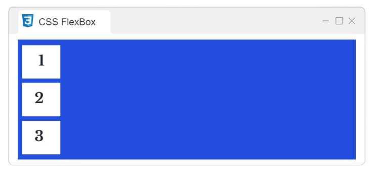
Flex Direction
It defines the direction in which the flex elements are displayed. It takes parameters like row, column, row-reverse, and column-reverse.
Example:
HTML
              <!DOCTYPE
              html>


               <html>


               <head>


               <title>

            CSS FlexBox


                </title>


                </head>


               <body>


                   <div
              class="flex-container">


                     <div>

            1

               </div>


                     <div>

            2

               </div>


                     <div>

            3

               </div>


               </div>


                </body>


                </html>
CSS
            .flex-container
            {

                display: flex;

                flex-direction: column;

                background-color: #234EDDFF;

            }


            .flex-container
            div
            {

                background-color: white;

                margin: 10px;

                text-align: center;

                line-height: 75px;

                font-size: 30px;

            }
Output
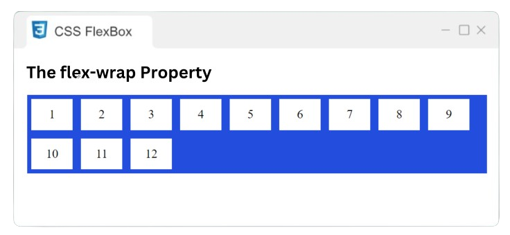
Flex Wrap
The flex-wrap property defines whether the flex items should wrap or not.
Example:
HTML
              <!DOCTYPE
              html>


               <html>


               <head>


               <title>

            CSS FlexBox


                </title>


                </head>


               <body>


                   <div
              class="flex-container">


                     <div>

            1

               </div>


                     <div>

            2

               </div>


                     <div>

            3

               </div>


                     <div>

            4

               </div>


                     <div>

            5

               </div>


                     <div>

            6

               </div>


                     <div>

            7

               </div>


                     <div>

            8

               </div>


                     <div>

            9

               </div>


                     <div>

            10

               </div>


                     <div>

            11

               </div>


                     <div>

            12

               </div>


               </div>


                </body>


                </html>
CSS
            .flex-container
            {

                display: flex;

                flex-wrap: wrap;

                background-color: #234EDDFF;

            }


            .flex-container
            div
            {

                background-color: white;

                margin: 10px;

                text-align: center;

                line-height: 75px;

                font-size: 30px;

            }
Output
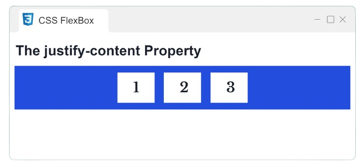
Justify Content
The justify-content property is applied to align the flex items on the main axis.
Example:
HTML
              <!DOCTYPE
              html>


               <html>


               <head>


               <title>

            CSS FlexBox


                </title>


                </head>


               <body>


                   <div
              class="flex-container">


                     <div>

            1

               </div>


                     <div>

            2

               </div>


                     <div>

            3

               </div>


               </div>


                </body>


                </html>
CSS
            .flex-container
            {

                display: flex;

                justify-content: center;

                background-color: #234EDDFF;

            }


            .flex-container
            div
            {

                background-color: white;

                margin: 10px;

                text-align: center;

                line-height: 75px;

                font-size: 30px;

            }
Output
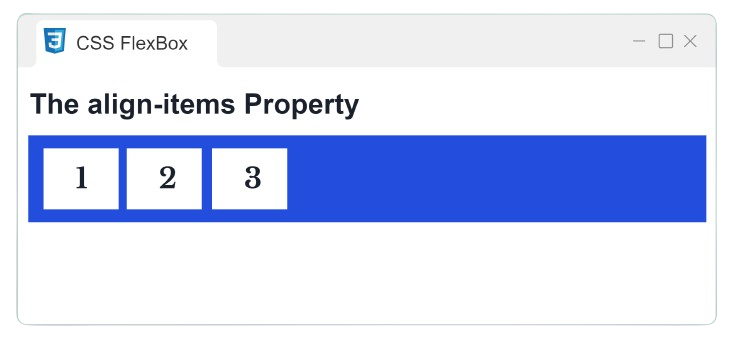
Align Items
The align-items property is utilized to align the flex items along the cross-axis.
Example:
HTML
              <!DOCTYPE
              html>


               <html>


               <head>


               <title>

            CSS FlexBox


                </title>


                </head>


               <body>


                   <div
              class="flex-container">


                     <div>

            1

               </div>


                     <div>

            2

               </div>


                     <div>

            3

               </div>


               </div>


                </body>


                </html>
CSS
            .flex-container
            {

                display: flex;

                align-items: center;

                background-color: #234EDDFF;

            }


            .flex-container
            div
            {

                background-color: white;

                margin: 10px;

                text-align: center;

                line-height: 75px;

                font-size: 30px;

            }
Output
Flex Items Properties
The properties of the flex items are:
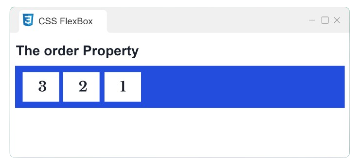
Order
The order property is utilized to specify the order of the flex items.
Example:
HTML
              <!DOCTYPE
              html>


               <html>


               <head>


               <title>

            CSS FlexBox


                </title>


                </head>


               <body>


                   <div
              class="flex-container">


                     <div
              style="order: 3">

            1

               </div>


                     <div
              style="order: 2">

            2

               </div>


                     <div
              style="order: 1">

            3

               </div>


               </div>


                </body>


                </html>
CSS
            .flex-container
            {

                display: flex;

                flex-direction: row;

                background-color: #234EDDFF;

            }


            .flex-container
            div
            {

                background-color: white;

                margin: 10px;

                text-align: center;

                line-height: 75px;

                font-size: 30px;

            }
Output
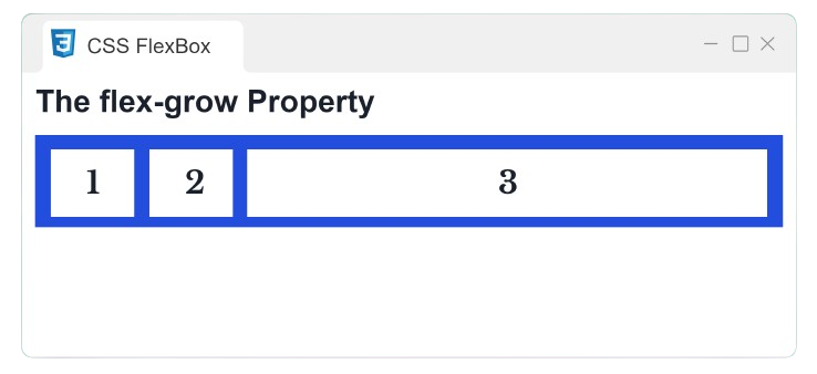
Flex Grow
The flex-grow property is utilized to specify how much a flex item grows relative to the other flex items.
Example:
HTML
              <!DOCTYPE
              html>


               <html>


               <head>


               <title>

            CSS FlexBox


                </title>


                </head>


               <body>


                  <div
              class="flex-container">


                   <div
              style="flex-grow: 1">

            1

               </div>


                   <div
              style="flex-grow: 1">

            2

               </div>


                   <div
              style="flex-grow: 8">

            3

               </div>


               </div>


                </body>


                </html>
CSS
            .flex-container
            {

                display: flex;

                flex-direction: row;

                background-color: #234EDDFF;

            }


            .flex-container
            div
            {

                background-color: white;

                margin: 10px;

                text-align: center;

                line-height: 75px;

                font-size: 30px;

            }
Output
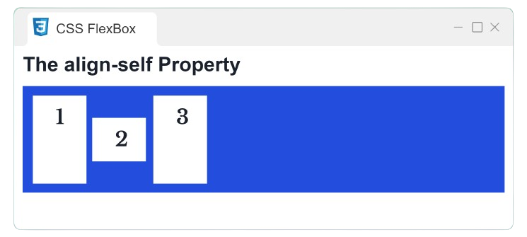
Align Self
The align-self property is utilized to specify the alignment of the given item within the flex container.
Example:
HTML
              <!DOCTYPE
              html>


               <html>


               <head>


               <title>

            CSS FlexBox


                </title>


                </head>


               <body>


                  <div
              class="flex-container">


                    <div>

            1

               </div>


                 <div style="align-self: center"> 2 </div>


                    <div>

            3

               </div>


               </div>


                </body>


                </html>
CSS
            .flex-container
            {

                display: flex;

                height: 200px;

                background-color: #234EDDFF;

            }


            .flex-container
            div
            {

                background-color: white;

                width: 100px;

                margin: 10px;

                text-align: center;

                line-height: 75px;

                font-size: 30px;

            }
Output